Friday 18 March 2016

Sarah Maycock and Catherine Rayner

Sarah Maycock

Both of these practitioners draw animals in a beautiful and expressive way which I aspire to. 


Catherine Rayner


This work is very texture driven, both illustrators use only white space to surround their images, so that the beautiful images speak for themselves - this is something which I apply to my own work.


Thursday 17 March 2016

Competition Brief

http://www.cheltenham-illustration-awards.com/p/about.html

Tales of Nonsense

Deadline: 1st June 2016.

Requirements:

File image size: (Portrait or landscape) 50x40 cm max, 300dpi
Image format: High quality JPEG

File Name: (FirstName_LastName) 

I might set myself the challenge of doing this brief in a day

Tuesday 15 March 2016

Progress Tutorial - Patrick


Today's tutorial was exciting, Patrick suggested that I take my general information I have formulating about sharks and in particular the relationship that man and shark have, and aim towards making it into an interactive and illustrative educational exhibition scheme. In which I use the space at the deep to present all of my shark information in a fun and interactive way. I should look at making:
  • Information displays
  • Floor vinyl elements/guides
  • Mobiles
  • Diving type masks that participants might wear
  • Etc
I should act and ask individuals about it as if I were actually going to run it/propose it to The Deep, this means contacting people in Hull and at the Deep and asking for advice and information on how I might go about this. I should look at applying for funding perhaps with their arts/science/education council. 

To achieve this I will need to partner with experts on Sharks, so that I can be sure the information is sound and the content helpful and accurate. Such as the contact I found for the man leading a shark campaign for the WWF. 

This exhibition proposal could also be planned and adapted with the end of year degree show in mind. I could utilise the space that hangs down all three floors (maybe not infringing on graphics below). I should consider how I could make the most of that space as a bit of a 3D aquarium, already I have some ideas about how I could turn my drawings into prints and mobiles. 

Sharks are dangerous, but they are fantastic, well designed, important and endangered creatures that deserve and need our respect.

Gordon Ramsey - Shark Bait

I watched this documentary with gordon Ramsey, where set off on a personal investigation project to learn more about shark fin soup trade, and exactly just how damaging it is to the sharks.


It was interesting and informative, and gave quite a good run through, from the consumers to the catchers and gave a good impression of what went on in between too.

With a more reportage focus on this now, I started considering how I might choose out a few scenes to illustrate, much in the same way that Oliver Kugler creates a scene - with a mix of view points and bits of writing, a little such as this one below:

I like the way the line work continues into different scenes. The blocks of colour really bring it together as a balanced image, and it is a great sprawling way to get a great quantity of information into one piece and not be limited by viewpoint and creating a scene. I think this way of working will suit my aesthetic.

I had a go at some more reportage way for working with some of the visual research that I gathered in Hull:


I really like this way of working, however the issue is now finding more opportunities to draw on location, as this is how I can make these drawings successful, my attempts at illustrating scenes from Gordon Ramsey's documentary were not an initial success. I want my own real life views so I can make more of my own comment on them with my image making I suppose.

With regards to these images that I have produced already, areas of improvement are:
  • More dynamic scene.
  • Better impression of subject matter - make it more engaging for the viewer, with a clearer aim at which subject content to include.
  • Try working on a larger scale, with bigger drawings so that I can allow more detail to come out.
  • Make use of block colour to guide the image, much like Kugler does. To be successful at this I should start with my line work instead. (I bought some waterproof ink - from a tip that I read on Quentin Blake's website - so this should even be possible with dip nib and ink, my fave.)
  • Have more information/knowledge behind what I am drawing, the more that I am an authority on the subject the better i can stage such an image.


Monday 14 March 2016

Progress Crit - Peer Feedback

Comment on the breadth of initial ideas produced in response to the brief?

Strengths:
  • Done an extensive amount of initial drawing investigation. Also you've gathered quite a lot of facts and information about sharks. You have a focus and narrowed down to being about sharks.
  • Strong initial ideas
Suggestions:
  • Start defining what it is you would like to get out of this. 
  • Whilst initial ideas are string, you seem to be unsure where to take the project. Perhaps make and response to the 'jaws' effect.
Comment on the scope and scale of the development of ideas in response to the brief?

Strengths:
  • Good development of ideas.
  • Lots of development work and great you got some first hand research visiting the Deep.
Suggestions:
  • You've got a strong development here but can more be done? Maybe move out of your sketchbook like Emmanuel?
  • Start forming a focus of what it is you intend to produce? maybe begin working on bigger sheets and out of your sketchbook.
Comment on the visual quality of the development work.

 Strengths:
  • Watercolours is definitely a strength of yours.
  • Excellent use of watercolours and inks.
Suggestions:
  • Perhaps move away from watercolours and inks for a time, see what other media can create.
  • Invest in great quality watercolour paper sheets to work on. Maybe investigate other media and try some collage or something with your work. 
Comment on the effectiveness of the proposed resolution in response to the problem set.

Strengths:
  • You have already started on a lot of visual research which helps and contributes in getting an idea of what it is you would like to produce.
Suggestions:
  • You seem a bit lost with idea resolution. Maybe this is due to differing input. Perhaps find a suitable idea and stick with it.
At the moment you don't have a definite plan for what your final resolution will be. So you do need to start having an idea so you can have a focus.

General Comment:
  • Really like your work atm, I think you need to define the projects purpose and end results though.
  • Lovely drawings. I particularly like the ones with movement of the shark (End of little green sketchbook) Though in contrast I love the shark in the back of the little black sketchbook. 


The feedback was helpful and clearly identified some areas of positives and things that need work:

overall positives :
  1. Good initial idea generation/project area - just need to refine it down into what sort of specific direction that would work best.
  2. Watercolours and expressive drawings are successful - keep pushing these.
  3. Good research, both first hand and general - should look for areas to narrow it down, and continue to refine it.
Areas needing attention:
  1. Needs focus
  2. I'm a clear plan for my final resolution - this is so that I can have a focus to guide me.
  3. I should move out of sketchbooks and get some more exciting/finished type artwork on the go.
This crit was helpful, especially in terms of seeing where everyone else is at with their projects - it provides a bit of a benchmark to see where I should be at, and gives ideas for where I could be taking this project - also in terms of scope and scale.

Friday 11 March 2016

War Horse Book Marks

I decided to make a spinoff range of bookmarks to go with my War Horse brief, as this is a medium which is very appropriate to books. I decided to use the imagery that I used for the creation of my final pieces, so that it could be used as a further promotional campaign for Folio Society.


I did some research into what promotional publishing bookmarks might look like. I found that many of them use the same imagery as the original book cover, but also that they can be very text heavy. 

From my prior research into the folio society and going along the guidelines of the brief I know that they do not require their cover designs to be very text heavy, so I will keep mine this way also.


Here is my development and testing of different compositions:
Here is my finalised finished book mark designs:


I think there is scope for these designs to be improved further, the colours could be made more engaging and I don't think that I managed to completely capitalise on the composition. However I do think I am headed on the right track by taking out the base drawing elements of the original designs for the book. The simply draw horse and figure has big potential to be striking and engaging to a wider readership. It is not exclusively children aimed illustration, but more aiming for simplicity, emotional engagement which I hope can be appealing to readers of all ages.

Frog - Creatures


H

Thursday 10 March 2016

Image Creation - Testing Composition

Early Composition Development:


I muted the colours of the stable structure and that definitely helped. 


I have added the horses backend but I am still undecided wether or not to include it as I like the simplicity of the head and neck.


This is my first of the three illustrations that will exist within the book,
h


Further Image Development

  • Felt images were floating, but at the same time didn't want to overcrowd with wonky backgrounds as the characters are more powerful when left simple. 
  • Included a texture that helped to unite them, worked on fading this so that it did not stand out too much and settled more into the background, so that it could add to the overall sense of atmosphere. 
  • Decided to keep horses simple, just showing the parts of them that mattered and need communicating. 
  • I am still unhappy that some seem to sort of float, but I can't spend forever on this brief and I felt that adding in more background did not lend itself to the aesthetic. 


J

Finalising Designs for the cover:

I printed it out a few times to see what it looked like and then decided to simplify it and take out the additional wire and tree stumps from the front cover. I tried adding a similar texture to keep them connected to the illustrations inside the book. I found this helped and it also united the front cover to the back cover. 


I cannot decide between the galloping horse and the horse and figure for which one works better on the front cover. on screen I felt that it was the more simple standing image that worked the best , but when I printed them both out I felt that the galloping horse was a better looking picture and perhaps more emotionally striking. The figure I fell is more relevant to the content of the book, it encapsulates the main theme of one boy and his powerful bond with his horse, it also communicates the strong themes of friendship and love.

Wednesday 9 March 2016

Contacting the Deep

In a bid to learn more about my big K sharks project, I sent a message of enquiry to the Deep asking if I could have a contact for the head curator, Katy Duke, or if I could come back and talk to any of their staff.  Hopefully this will present me with an opportunity to gain more first hand drawings, and research learning experience, which is so much more beneficial to my project!


They got back to me fairly swiftly and gave me her email. I emailed her and she then wrote back telling me that my project sounded interesting and that she had passed my email along to Graham Hill their Science Officer, who would be in touch soon.

I got a reply from their senior science officer, Graham Hill!


I have since been to visit and have been contacting him since.

Tuesday 8 March 2016

Illustrating Information

http://www.theguardian.com/uk-news/shortcuts/2016/mar/07/laws-you-can-get-away-with-breaking-probably-smoking-car-children?CMP=fb_gu

Proposal Forms Bloop G


I suggested we create worksheets with prompts and imagery for the imagination station, here was my rough proposal. I am finding with this project that I can come up with the ideas and help curate the others ideas, but I am not as good as them at pro ducting the work itself, much of this is down to my aesthetic, and more messy approach to image making.


We also decided to source our materials for the creation side of the project from Scrap. A place based in Pudsey.

We went to visit, and came back with a great wealth of different fantastic materials.


Monday 7 March 2016

Hull research Trip

http://voices.nationalgeographic.com/2015/07/08/zebra-sharks-gentle-sweet-and-disappearing/

At the Deep aquarium I saw three juvenile zebra sharks which were incredibly inquisitive and lovely to see and be around.


Secret 7 - Final Designs

 Here are my 7 final designs, you can see them mocked up onto the record sleeve as they are designed for. I also found that this imagery worked on a range of different products.

Gift Cards:


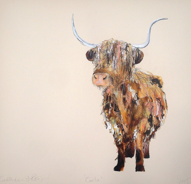
Below are the final designs that I submitted, it wasn't until I had them all together like this that I realised just how many of them had a white background. This is not ideal, and made me think that if I were to try and improve them or do this again I would work harder to test out and try different backgrounds and compositions that encourage colour and texture into all of the space.
This came about because will all of them I was so concept driven, I got too tangled up in having well thought out concepts in the imagery. The oner reason for the poorly composed images is that it is still something I struggle with, I'm not sure where to begin and when I do use it I don't like it, or it's flat and to me doesn't seem to add anything. I think however that I can identify after doing this, that I should source secondary opinions from others who do have a good eye and mind for this.The text explains the concept behind each piece


1 Dream 3 Max Richter
The whale embodies the calm, steady nature of the music; the rhythm is like that of a large whale steadily yet powerfully travelling onwards


2. Chvches - Clearest Blue
The imagery encapsulates the tail chasing, push & pull nature of the track highlighted in verse 3. The colours reflect the music's vibrancy.


3. Jack Garrat - Worry
This aims to convey the fraught, brittle nature of worrying. The translucent skeleton shows the tenderness of baring worries.


4. The Less I know the better
Back to back horses, not looking but they can't resist so they chase hypnotically in a fluid dance like way. (Themes: Evading, wanting.)


5. Imagine - John Lennon
Two horse's mournfully and tenderly reach out to each other, just as the song reaches out to us to consider a world of equality and peace.


6. Dream 3
The images aims to look like the music sounds. The horse gallops in a steady powerful rhythm, the sky peacefully rolls out behind.


7. John Lennon - Imagine
John Lennon describes a world which has no differentiation, all can be equal. The altered colours aim to inspire imagining such difference.


Wednesday 2 March 2016

Children's Workshop Proposal

I attended a briefing about creating a proposal for Elcaf,


Bloop


workshop proposals for both Elcaf and Anorak.


Proposal for Elcaf:

Slim idea down so that the main and only focus in on the workshop sheets. The worksheets would be more adapted to encourage a child/person to produce some sequential work


War Horse Sketchbook

Here is a PDF of some of the key bits of my sketchbook for this brief which show the progression and investigation into different drawing techniques and approaches that I took. I step away from the more complex drawings that I begin with. It also shows relatively well the development and refinement of my chosen simple lines ink process. 


War Horse


These are my initial finished designs, if i have time later I will come back and revise them as I think there is large scope for improvement.


Crispin Orthotics

Making braces and splints more exciting for patients.

- Not just insole and shoes, look at realigning the body.
- Diseases that effect young people, they spread and become debilitating.

Create patterns to apply to devices - can be multiple.

3 prizes £150, 2nd £100, £50. If general flare is liked then they want to use you as a go to designer. Also scope for further comissioning.

UNderstand company.

sharcomanarytooth (Can't spell.) Have to use hips and knees to get foot clearance - can't stand still.
Can be for torso, also various legs and arms. Try to make designs as generic as you can.

Very open to what they want, males females or mixed.

Constraints:

  • Fixed shape of splint. Shape is very important to functionality so can't be changed.
  • Silicone. (Material used)
  • Ankle picture can get distorted. pattern best, or small image maybe on front and higher up. Design around the shape of the limbs.
  • Plastic, designs tend to bleed into the material. Use fine black outline.
  • Onto stocking net, 
  • Plastic comes out of oven, then moulded whilst hot. Stretched/draped. Area of heel very distorted. Focus on back of calf section. 
  • Safer to go for pattern or print. Limb portrait. Heads square. Torso, Landscape.
  • Looks very different on the cast. Try not to get caught up in specific angles.
  • Targeting adult designs.
  • Thermoplastic - bleeds. Consider which 
  • Silicone mainly on lower limbs, uses fabric to print design - cotton, nylon lots of polyester. 
  • Plastic used elsewhere on the body.
  • Emailing maximum of 1MB.
  • Looks very different on the cast. Try not to get caught up in specific angles.
Very inexperienced at design as a company.
Inspiration boards:

'Old fashioned' traditional 0 still used metals and leathers. Nice authentic feel. Artisan, Artefact. - Make this cool and currant.

'Futuristic' Robotic, quite high tech, This is where company is moving towards.

Only company that can have this freedom of patterns in the industry. Consider what you would want if this was you.

Deliverables

(Send email's if stuck) sales@crispinorthotics.com

  • Jpeg.
  • Limb portrait. Heads square. Torso, Landscape.
  • No need for logo.
  • Find presentation in employability and enterprise on estudio.
  • A design that people are not ashamed of wearing.
Here is the actual Brief: