Your Initial Brief Two - Photoshop
I think that now would be a sensible time to mention that I have had very limited experience with photoshop in the past, and so this brief has been a very useful and rapid learning curve for me.
I have now successfully got the hang of restoring my images with photoshop. cleaning up the background, repositioning and sizing the image and adjusting the levels. I did this to all five of my images before working into them further.

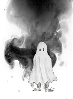
The first image above is a perfect example of how I really am just not very good at photoshop at all but its still fun to play with. Its something of an infinite tool, you can do such a vast array of things with it. At first I wanted to include the ink stains behind the ghost as the swirly, smokey look it has is perfect material for ghosts. I've still not got the hang of how I can integrate into the image. The image to the left is a slightly more sensible version of this haphazard solution. The third one has had a very small amount of colour added to it, I think that for it to be effective I will need to make it brighter and more apparent though, but otherwise I think it could help lend to the comical nature of a makeshift ghost costume.
Experimenting here with adding in textures, and creating perfectly straight lines with the paint brush tool by using the shift key to create the floor and skirting boards. I definitely could have found a better texture to use for the wall paper but I liked the idea of using some of my own scanned textures.
My most elaborate photoshop creation yet. I've put a number of the newly discovered tools into practice here. Its a very long way from perfect, and I still feel that the textures used to create the colours of the ocean and the countries are a bit too over powering, despite my efforts, but I do quite enjoy the colour and the shape of the countries a bit, there is potential here. I decided to put use maps as a part of this design as the whole idea behind the book shelve letter was the type of books and music that my partner is interested in. Particularly this works well for his music tastes, as he didn't have favourite bands or genres, and so perhaps the map can convey this sense of diversity. Also a number of his favourite books leaned towards the more adventure and exploring.
Adding colour and to the figure, and then experimenting with different sorts of back ground that it is possible to create. Its not the best work, the stroke of textured bush stroke in the background does tie the image together a little more.
My photoshop images are all too different to work aesthetically well as a series, but some of them begin to covey the concept behind each of these initial idea sketches. Although these images are not very impressive, or polished looking, I still feel that I have gained quite a lot from this brief, and that I have a basic enough grounding in photoshop to feel far more comfortable to have it as a tool that I can use more often and a little more effectively now.


No comments:
Post a Comment